
elevne's Study Note
React Native (4-3: RN 컴포넌트 알아보기(Button, TouchableHighlight, Pressable)) 본문
React Native (4-3: RN 컴포넌트 알아보기(Button, TouchableHighlight, Pressable))
elevne 2023. 2. 21. 21:07웹 기반 인터페이스에서는 마우스 형태의 컨트롤러를 위해 디자인되었다. Hover 상태 등을 이용하여 사용자에게 인터랙션 기능 여부를 표시하는데, 모바일은 이와는 다르게 터치 기반이다. RN 에서는 터치에 반응하는 인터페이스를 만들 수 있도록 여러 API 를 제공한다. Button, TouchableHighlight, Pressable 를 사용할 수 있다.
<Button
  onPress={onPressLearnMore}
  title="Learn More"
  color="#841584"
  accessibilityLabel="Learn more about this purple button"
/>
위와 같은 코드로 Button 컴포넌트를 사용할 수 있다. onPress 는 웹페이지에서 onClick 과 같은 역할을 한다고 생각하면 되고, title prop 으로 넣은 값이 버튼 안에 보이게 되는 글자이다. 위 두 속성은 Button 컴포넌트에 필수적으로 필요한 props 이다. 아래와 같은 코드로 버튼을 여러 개 분리해서 만들어볼 수 있다.
import React from 'react';
import {
StyleSheet,
Button,
View,
SafeAreaView,
Text,
Alert,
} from 'react-native';
const Separator = () => <View style={styles.separator} />;
const App = () => (
<SafeAreaView style={styles.container}>
<View>
<Text style={styles.title}>
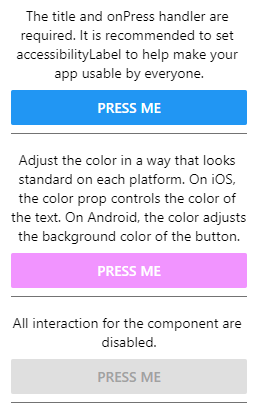
The title and onPress handler are required. It is recommended to set
accessibilityLabel to help make your app usable by everyone.
</Text>
<Button
title="Press me"
onPress={() => Alert.alert('Simple Button pressed')}
/>
</View>
<Separator />
<View>
<Text style={styles.title}>
Adjust the color in a way that looks standard on each platform. On iOS,
the color prop controls the color of the text. On Android, the color
adjusts the background color of the button.
</Text>
<Button
title="Press me"
color="#f194ff"
onPress={() => Alert.alert('Button with adjusted color pressed')}
/>
</View>
<Separator />
<View>
<Text style={styles.title}>
All interaction for the component are disabled.
</Text>
<Button
title="Press me"
disabled
onPress={() => Alert.alert('Cannot press this one')}
/>
</View>
<Separator />
<View>
<Text style={styles.title}>
This layout strategy lets the title define the width of the button.
</Text>
<View style={styles.fixToText}>
<Button
title="Left button"
onPress={() => Alert.alert('Left button pressed')}
/>
<Button
title="Right button"
onPress={() => Alert.alert('Right button pressed')}
/>
</View>
</View>
</SafeAreaView>
);
const styles = StyleSheet.create({
container: {
flex: 1,
justifyContent: 'center',
marginHorizontal: 16,
},
title: {
textAlign: 'center',
marginVertical: 8,
},
fixToText: {
flexDirection: 'row',
justifyContent: 'space-between',
},
separator: {
marginVertical: 8,
borderBottomColor: '#737373',
borderBottomWidth: StyleSheet.hairlineWidth,
},
});
export default App;
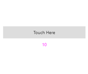
위 Button 컴포넌트는 쓸만하긴 하지만 실제 앱을 만들다보면 상호작용이 가능한 컴포넌트를 만들어야 하기에 TouchableHighlight 가 더욱 유용하게 사용될 수도 있다고 한다.
버튼이나 컨트롤 요소와 같이 사용자의 터치에 반응하는 엘리먼트는 보통 TouchableHighlight 컴포넌트에 의해 감싸져있다고 한다. 이 컴포넌트는 뷰가 터치될 때 오버레이를 추가하여 사용자에게 시각적인 피드백을 줄 수 있다. 사용법으로는, 사용자가 눌렀을 때 간단한 오버레이가 추가되길 원하는 컴포넌트를 TouchableHighlight 컴포넌트로 감싸기만 하면 된다. Button 과 같이 onPress props 를 추가하여 눌렀을 때 발생시킬 함수 또한 지정할 수 있다.
import React, {useState} from 'react';
import {StyleSheet, Text, TouchableHighlight, View} from 'react-native';

const TouchableHighlightExample = () => {
  const [count, setCount] = useState(0);
  const onPress = () => setCount(count + 1);

  return (
    <View style={styles.container}>
      <TouchableHighlight onPress={onPress}>
        <View style={styles.button}>
          <Text>Touch Here</Text>
        </View>
      </TouchableHighlight>
      <View style={styles.countContainer}>
        <Text style={styles.countText}>{count || null}</Text>
      </View>
    </View>
  );
};

const styles = StyleSheet.create({
  container: {
    flex: 1,
    justifyContent: 'center',
    paddingHorizontal: 10,
  },
  button: {
    alignItems: 'center',
    backgroundColor: '#DDDDDD',
    padding: 10,
  },
  countContainer: {
    alignItems: 'center',
    padding: 10,
  },
  countText: {
    color: '#FF00FF',
  },
});

export default TouchableHighlightExample;
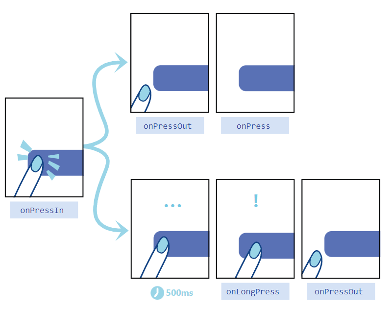
또 이와 유사하게 Pressable 컴포넌트를 사용할 수 있다. 이 또한 TouchableHighlight 와 같은 것이라고 볼 수 있는데 더욱 다양한 props 를 지정하여 사용해볼 수 있다. 예를 들어, onPressIn 을 사용하여 Press 가 activate 된 상태, onPressOut 을 사용하여 Press 가 deactivate 된 상태를 구분할 수 있다. 또, 사용자가 500 milli seconds 보다 길게 버튼을 누르고 있을 시, onLongPress 가 작동될 수 있다.
또, 사용자들은 손가락으로 정확하게 버튼을 클릭하지는 않는다. 실수로 다른 요소를 건들이는 일, 버튼을 누르지 못하는 일이 빈번하게 발생하게 된다. 이 때, Pressable 의 HitRect 속성을 사용하여 버튼에서 얼마나 먼 거리까지 버튼을 누른 것으로 인식할 것인지 지정해줄 수 있다. HitRect 범위 내에서는 Press 액션이 일어날 수 있는 것이다. 또한, PressRect 라는 속성을 사용하여 버튼을 눌러 활성화한 채로 요소를 너머 움직일 수 있게끔 할 수 있다. 버튼을 누른 상태에서 손가락을 천천히 Slide 하는 것을 상상해보면 된다.
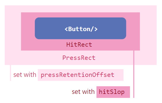
위 두 속성은 hitSlop, pressRetentionOffset props 로 설정될 수 있는 것들이다.
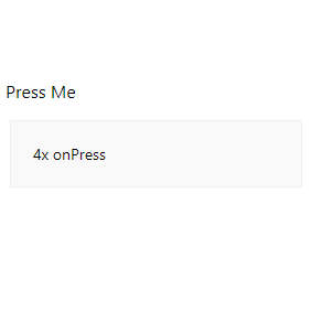
import React, {useState} from 'react';
import {Pressable, StyleSheet, Text, View} from 'react-native';

const App = () => {
  const [timesPressed, setTimesPressed] = useState(0);

  let textLog = '';
  if (timesPressed > 1) {
    textLog = timesPressed + 'x onPress';
  } else if (timesPressed > 0) {
    textLog = 'onPress';
  }

  return (
    <View style={styles.container}>
      <Pressable
        onPress={() => {
          setTimesPressed(current => current + 1);
        }}
        style={({pressed}) => [
          {
            backgroundColor: pressed ? 'rgb(210, 230, 255)' : 'white',
          },
          styles.wrapperCustom,
        ]}>
        {({pressed}) => (
          <Text style={styles.text}>{pressed ? 'Pressed!' : 'Press Me'}</Text>
        )}
      </Pressable>
      <View style={styles.logBox}>
        <Text testID="pressable_press_console">{textLog}</Text>
      </View>
    </View>
  );
};

const styles = StyleSheet.create({
  container: {
    flex: 1,
    justifyContent: 'center',
  },
  text: {
    fontSize: 16,
  },
  wrapperCustom: {
    borderRadius: 8,
    padding: 6,
  },
  logBox: {
    padding: 20,
    margin: 10,
    borderWidth: StyleSheet.hairlineWidth,
    borderColor: '#f0f0f0',
    backgroundColor: '#f9f9f9',
  },
});

export default App;
Reference:
빠른 모바일 앱 개발을 위한 React Native
'Frontend > React Native' 카테고리의 다른 글
| React Native (4-5: RN 컴포넌트 알아보기(FlatList, ActivityIndicator)) (0) | 2023.02.24 |
|---|---|
| React Native (4-4: RN 컴포넌트 알아보기(PanResponder, Animated)) (0) | 2023.02.22 |
| React Native (4-2: RN 컴포넌트 알아보기(Image)) (0) | 2023.02.20 |
| React Native (4-1: RN 컴포넌트 알아보기(Text)) (0) | 2023.02.19 |
| React Native (3-2: RN 날씨앱 만들어보기) (0) | 2023.02.18 |


