
elevne's Study Note
React Native 로 To-Do App 만들기 (1) 본문
React Native 기반 To Do 앱을 만들어보기로 하였다. 우선 원하는 경로로 들어가서 React Native 프로젝트를 아래와 같은 명령어로 생성해준다.
create-react-native-app rn-todo
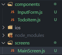
그 후, 우선 아래 이미지와 같이 디렉토리와 컴포넌트들을 생성해준다.
위 컴포넌트 중 MainScreen.js 는 Todo 앱의 메인화면을 담당하게될 컴포넌트이다. 아래와 같은 코드로 작성된다.
import { View, Text, SafeAreaView, Platform } from 'react-native'
import React from 'react'
import { StyleSheet } from 'react-native'
import { StatusBar } from 'expo-status-bar'

const MainScreen = () => {
  return (
    <SafeAreaView style={styles.container}>
      <StatusBar
      barStyle={"default"}
      />
      <Text style={styles.pageTitle}>ToDo App</Text>
      <View style={styles.listView}>
        <Text style={styles.listTitle}>TO DO</Text>
      </View>
      <View style={styles.separator}/>
      <View style={styles.listView}>
        <Text style={styles.listTitle}>DONE</Text>
      </View>
    </SafeAreaView>
  )
}

export default MainScreen

const styles = StyleSheet.create({
  container: {
    flex: 1,
    paddingTop: Platform.OS === 'android' ? 20 : 0, // ANDROID 와 IOS 의 분기처리 (이유: IOS 에서는 이미 SafeAreaView 를 사용했기 때문)
    backgroundColor: "#f7f8fa"
  },
  pageTitle: {
    marginBottom: 35,
    paddingHorizontal: 15,
    fontSize: 50,
    fontWeight: "600"
  },
  separator: {
    marginHorizontal: 10,
    marginTop: 25,
    marginBottom: 10,
    borderBottomWidth: 1,
    borderBottomColor: "rgba(0,0,0,0.2)"
  },
  listView: {
    flex: 1,
  },
  listTitle: {
    marginBottom: 25,
    paddingHorizontal: 15,
    fontSize: 40,
    fontWeight: "500"
  }

})
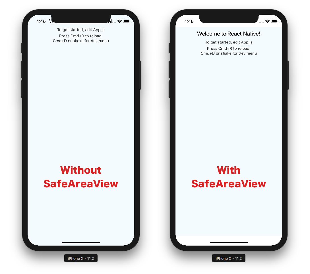
위 코드에서 사용되는 <SafeAreaView> 는 장치의 안전 영역 경계 내에서 콘텐츠를 렌더링하게끔 하는 역할을 한다. (현재 iOS 버전 11 이상이 설치된 iOS 기기에서만 적용된다) 예를 들자면, 아이폰을 사용하며 아래 사진과 같이 화면이 처리되지 않도록 해주는 것이다.
<StatusBar> 컴포넌트도 사용하였다. 이는 앱의 상태 표시줄을 제어하는 구성 요소이다. 상태 표시줄이란 일반적으로 화면 상단에 있는 영역으로 현재 시간, Wi-Fi 및 셀룰러 네트워크 정보, 배터리 잔량 및 기타 상태 아이콘을 표시하는 부분을 말한다.
그 다음으로는 InputForm.js 코드를 작성하였다.
import { View, Text, KeyboardAvoidingView, TextInput, Pressable, StyleSheet, Platform } from 'react-native'
import React from 'react'

const InputForm = () => {
  return (
    <KeyboardAvoidingView
        behavior={Platform.OS === "ios" ? "padding" : "height"}
        style={styles.addFormContainer}
    >
        <TextInput
            placeholder='Write your Todo'
            style={styles.inputField} />
        <Pressable
            style={styles.addButton}>
            <Text style={styles.addButtonText}>+</Text>
        </Pressable>
    </KeyboardAvoidingView>
  )
}

export default InputForm

const styles = StyleSheet.create({
    addFormContainer: {
        flexDirection: "row",
        marginTop: "auto",
        marginBottom: 30,
        paddingHorizontal: 20,
        backgroundColor: "#f7f8fa"
    },
    inputField: {
        flex: 1,
        height: 40,
        borderRadius: 4,
        borderColor: "rgba(0,0,0,0.2)",
        borderWidth: 1,
        color: "#000000",
        fontSize: 15,
        textAlignVertical:"center",
        padding: 5,
        marginRight: 25
    },
    addButton: {
        justifyContent: "center",
        alignItems: "center",
        width: 40,
        height: 40,
        borderRadius: 4,
        backgroundColor: "rgba(0,0,0,0.7)"
    },
    addButtonText: {
        color: "white",
        fontSize: 25
    }
})
이번에는 <KeyboardAvoidingView> 컴포넌트가 사용되었다. 이는 가상 키보드에서 벗어나야 하는 뷰의 일반적인 문제를 해결하기 위한 구성 요소이다. 키보드 높이에 따라 높이, 위치 또는 아래쪽 패딩을 자동으로 조절할 수 있는 것이다. 해당 컴포넌트 내에는 behavior 이라는 props 를 넣어주어야 한다. behavior 내에는 "padding", "height" 혹은 "position" 속성 값을 넣어줄 수 있다. padding 은 키보드가 열렸을 때 뷰의 하단에 패딩을 설정, height 는 뷰의 높이 자체를 변경, position 은 뷰의 위치를 설정한다.
<Pressable> 컴포넌트도 사용되었다. 이는 정의된 자식에 대한 다양한 Press 상호작용 단계를 감지할 수 있는 Core Component 이다. 아래 이미지와 같이 동작한다. Pressable 에는 hitRect 라는 props 를 설정할 수 있는데, 이를 설정함으로써 버튼을 누르는 범위를 늘려줄 수 있다.

위와 같이 작성해준 뒤 <InputForm> 컴포넌트를 MainScreen.js 하단에 넣어주면 된다.
첫 번째 단계의 마지막으로 <TodoItem> 컴포넌트를 작성하기 전, SVG 파일을 사용할 수 있게끔 설정을 진행한다. 아래와 같은 명령어로 진행한다.
npx expo install react-native-svg

npm install -D react-native-svg-transformer
react-native-svg 모듈은 SVG 요소나 속성들을 React Native 에서 사용할 수 있게끔 해주는 것이며, react-native-svg-transformer 모듈은 SVG 파일을 import 해서 사용할 수 있게끔 해주는 것이다.
위와 같이 진행해준 후, 프로젝트 디렉토리 내의 metro.config.js 에 아래 코드를 넣어준다. (이 소스코드는 react-native-svg-transformer 웹사이트(https://www.npmjs.com/package/react-native-svg-transformer?activeTab)에서 찾아볼 수 있다고 한다)
const { getDefaultConfig } = require("expo/metro-config");

module.exports = (() => {
  const config = getDefaultConfig(__dirname);

  const { transformer, resolver } = config;

  config.transformer = {
    ...transformer,
    babelTransformerPath: require.resolve("react-native-svg-transformer"),
  };
  config.resolver = {
    ...resolver,
    assetExts: resolver.assetExts.filter((ext) => ext !== "svg"),
    sourceExts: [...resolver.sourceExts, "svg"],
  };

  return config;
})();
이후 SVG 는 아래 링크를 참고하여 사용한다.
SVG Repo - Free SVG Vectors and Icons
Free Vectors and Icons in SVG format. ✅ Download free mono or multi color vectors for commercial use. Search in 500.000+ Free SVG Vectors and Icons.
www.svgrepo.com
위 링크에서 TodoItem 에서 사용할 체크박스, 체크된 체크박스, 삭제버튼 svg 파일을 다운로드 받는다. 그 후 해당 파일들을 프로젝트 내의 assets 폴더에 원하는 이름으로 바꾸어 복사한다. (복사한 후 이미지가 화면에서 안보이거나 사이즈가 너무 크거나 작다면 svg 파일을 에디터 내에서 열어서 수정해준다.)
SVG 파일들을 활용하여 아래와 같이 코드를 작성한다.
import { View, Text, Pressable, StyleSheet } from 'react-native'
import React from 'react'
import CheckboxUnchecked from "../assets/checkbox-unchecked.svg"
import CheckboxChecked from "../assets/checkbox-checked.svg"
import DeleteIcon from "../assets/delete.svg"

const TodoItem = () => {
  return (
    <View style={styles.itemContainer} >
      <Pressable style={styles.itemCheckbox} hitSlop={10}>

        <CheckboxUnchecked/>
        <CheckboxChecked style={styles.itemCheckboxCheckedIcon} />

      </Pressable>

      <Text style={[styles.itemText, styles.itemTextChecked]}>
        코딩하기
      </Text>

      <Pressable style={[styles.deleteButton, styles.deleteButtonDone]} hitSlop={10}>

        <DeleteIcon />

      </Pressable>

    </View>
  )
}

export default TodoItem

const styles = StyleSheet.create({
    itemContainer: {
        flexDirection: "row",
        alignItems: "center",
        paddingTop: 10,
        paddingBottom: 15,
        paddingHorizontal: 15,
        backgroundColor: "#f7f8fa"
    },
    itemCheckbox: {
        justifyContent: "center",
        alignItems: "center",
        width: 20,
        height: 20,
        marginRight: 15,
        borderRadius: 5,
    },
    itemCheckboxCheckedIcon: {
        shadowColor: "#000000",
        shadowOpacity: 0.2,
        shadowRadius: 8,
        shadowOffset: {
            width: 0,
            height: 4
        }
    },
    itemText: {
        marginRight: "auto",
        paddingRight: 25,
        fontSize: 15,
        lineHeight: 20,
        color: "#737373",
    },
    itemTextChecked: {
        opacity: 0.5,
        textDecorationLine: "line-through"
    },
    deleteButton: {
        opacity: 0.8
    },
    deleteButtonDone: {
        opacity: 0.3
    }
})
이렇게 작성한 뒤, MainScreen 에 TodoItem 을 하나 배치해보면 결과화면은 아래와 같다.
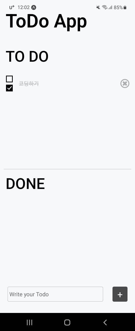
아직 아무런 기능도 구현이 되지 않은 상태이기에, 아무것도 할 수 없다. 다음 시간에는 Redux 를 설치하여 실제 기능들을 구현해볼 예정이다.
Reference:
'Frontend > React Native' 카테고리의 다른 글
| React Native: Redux (2) (0) | 2023.03.25 |
|---|---|
| React Native: Redux (0) | 2023.03.24 |
| Expo 정리 (0) | 2023.03.08 |
| React Native (5-1: 플랫폼 API - GetLocation) (0) | 2023.02.27 |
| React Native (4-6: RN 컴포넌트 알아보기(SectionList, Switch)) (0) | 2023.02.25 |


