
elevne's Study Note
React Native (4-6: RN 컴포넌트 알아보기(SectionList, Switch)) 본문
React Native (4-6: RN 컴포넌트 알아보기(SectionList, Switch))
elevne 2023. 2. 25. 22:30저번 시간에는 FlatList 컴포넌트에 대해서 알아보았고, 이번에는 이와 매우 유사한 SectionList 컴포넌트에 대해서 알아보았다. 다시 한 번 알아보자면, FlatList 는 내용이 변하는 긴 스크롤 리스트이지만 데이터 구조가 비슷한 경우를 위해 디자인되었고, SectionList 는 데이터를 섹션으로 구분해서 보여주어야 하는 경우를 위해 디자인되었다. 이번에도 예시 코드를 통해 확인해보았다.
import {
    StyleSheet,
    Text,
    View,
    SafeAreaView,
    SectionList,
    StatusBar,
  } from 'react-native';

const DATA = [
{
    title: 'Main dishes',
    data: ['Pizza', 'Burger', 'Risotto'],
},
{
    title: 'Sides',
    data: ['French Fries', 'Onion Rings', 'Fried Shrimps'],
},
{
    title: 'Drinks',
    data: ['Water', 'Coke', 'Beer'],
},
{
    title: 'Desserts',
    data: ['Cheese Cake', 'Ice Cream'],
},
];

const Test = () => (
<SafeAreaView style={styles.container}>
    <SectionList
    sections={DATA}
    keyExtractor={(item, index) => item + index}
    renderItem={({item}) => (
        <View style={styles.item}>
        <Text style={styles.title}>{item}</Text>
        </View>
    )}
    renderSectionHeader={({section: {title}}) => (
        <Text style={styles.header}>{title}</Text>
    )}
    />
</SafeAreaView>
);

const styles = StyleSheet.create({
container: {
    flex: 1,
    paddingTop: StatusBar.currentHeight,
    marginHorizontal: 16,
},
item: {
    backgroundColor: '#f9c2ff',
    padding: 20,
    marginVertical: 8,
},
header: {
    fontSize: 32,
    backgroundColor: '#fff',
},
title: {
    fontSize: 24,
},
});

export default Test;
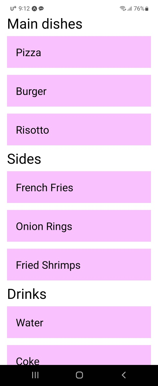
위 SectionList 컴포넌트 내에서 사용된 props 중 renderItem 과 sections 는 필수 props 라고 한다. renderItem 은 모든 섹션의 모든 항목에 대한 기본 렌더러이다. 섹션별로 재정의할 수 있으며, 이는 React Native 의 요소를 반환해야 한다. sections 는 렌더링을 진행할 데이터를 넣어주는 props 이다. 또, 위에서 renderSectionHeader 이라는 props 가 사용되었다. 이는 각 Section 맨 위에 렌더링될 것을 정의해주는 것이다 (renderSectionFooter 을 사용하여 밑 쪽에 넣을 수도 있다). 이 외에도 FlatList 에서 사용했던 ListFooterComponent 등의 props 또한 동일하게 사용해볼 수 있다.
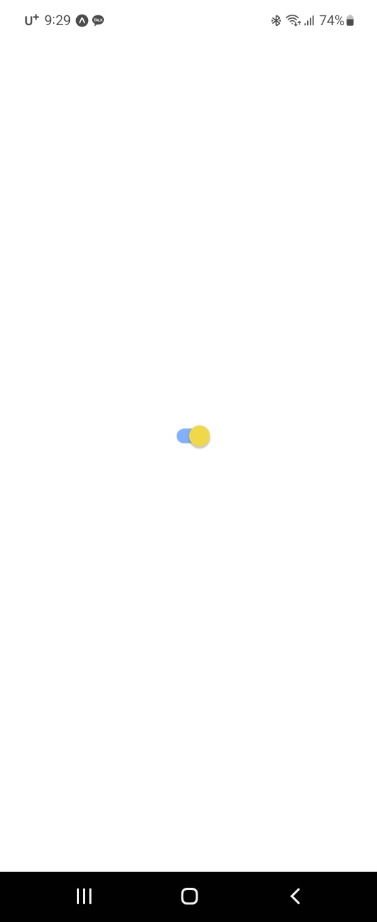
간단하게 SectionList 컴포넌트에 대해 알아본 후, Switch 컴포넌트 또한 사용해보았다. 우선 예시 코드는 아래와 같다.
import React, {useState} from 'react';
import {View, Switch, StyleSheet} from 'react-native';

const Test = () => {
  const [isEnabled, setIsEnabled] = useState(false);
  const toggleSwitch = () => setIsEnabled(previousState => !previousState);

  return (
    <View style={styles.container}>
      <Switch
        trackColor={{false: '#767577', true: '#81b0ff'}}
        thumbColor={isEnabled ? '#f5dd4b' : '#f4f3f4'}
        ios_backgroundColor="#3e3e3e"
        onValueChange={toggleSwitch}
        value={isEnabled}
      />
    </View>
  );
};

const styles = StyleSheet.create({
  container: {
    flex: 1,
    alignItems: 'center',
    justifyContent: 'center',
  },
});

export default Test;
크게는 trackColor, thumbColor, onValueChange props 가 사용되었다. 우선 onValueChange 는 사용자가 스위치 값을 변경하려고 할 때 호출되는 것이다. 새 값을 인수로 받는다. 새 값 대신에 event 를 받기 위해서는 onChange 를 사용하면 된다고 한다. trackColor, thumbColor 은 각각 위를 기준으로 isEnabled 값에 따른 switch grip, switch track 의 색상을 지정해줄 수 있는 props 이다. 결과화면은 아래와 같다.
'Frontend > React Native' 카테고리의 다른 글
| Expo 정리 (0) | 2023.03.08 |
|---|---|
| React Native (5-1: 플랫폼 API - GetLocation) (0) | 2023.02.27 |
| React Native (4-5: RN 컴포넌트 알아보기(FlatList, ActivityIndicator)) (0) | 2023.02.24 |
| React Native (4-4: RN 컴포넌트 알아보기(PanResponder, Animated)) (0) | 2023.02.22 |
| React Native (4-3: RN 컴포넌트 알아보기(Button, TouchableHighlight, Pressable)) (0) | 2023.02.21 |


